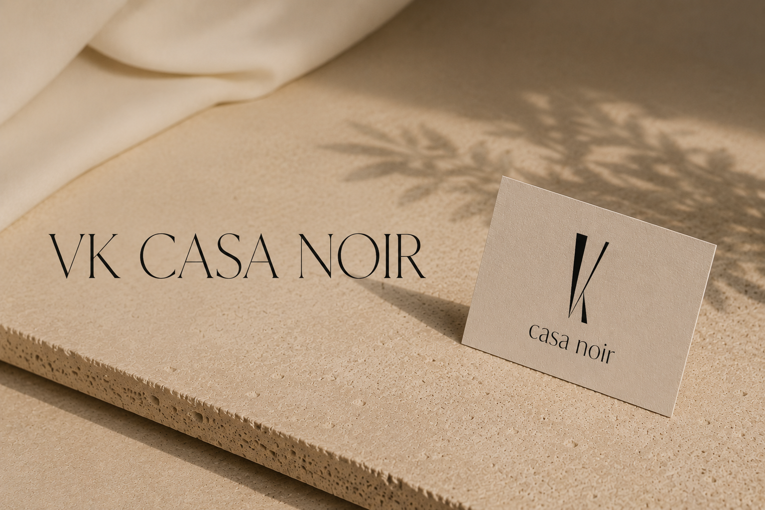
VK CASA NOIR
VK Casa Noir was born from two personal passions: a deep love for Spain and a vision to build a creative studio rooted in meaningful visual communication.
Every element of the name carries a purpose:
VK: Represents my initials, keeping the brand deeply personal and connected to every project I create.
Casa: Meaning "home" in Spanish, this reflects the warmth, rich culture, and aesthetic beauty of Spain. It represents a creative space where ideas are nurtured and grown into unique identities.
Noir: Meaning "black," this symbolizes depth, strategy, and the deliberate thought behind every design choice.
Founded on the belief that great branding blends purpose with beauty, the studio's visual identity combines minimalist geometric forms, elegant typography, and a soft, neutral color palette. VK Casa Noir is a collaborative space where creativity, strategy, and aesthetics meet to help brands tell their stories with absolute confidence.
Form and Color Rationale
Color Symbolism
Black | HEX #231F20
Black represents professionalism, authority, and trust. Widely used to convey high quality and expertise, it serves as the primary contrast element for VK Casa Noir, giving the logo clarity, strength, and visual impact. It also directly reflects the word Noir, symbolizing strategic depth and the intentional thinking behind every design decision.
White | HEX #FFFFFF
White introduces clarity, balance, and modern professionalism into the identity. It symbolizes minimalism and harmony, acting as the perfect counterweight to the deeper tones. Its presence enhances the studio's elegant aesthetic, creating a sense of openness, focus, and refinement.
Gold | HEX #A88D5D
Gold was selected to express understated luxury, elegance, and quality. This specific muted gold tone symbolizes stability and trust, reinforcing the brand’s premium market positioning. It injects a sense of exclusivity, contemporary sophistication, and lasting value into the entire visual identity.
Form Symbolism & Geometry
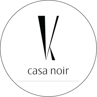
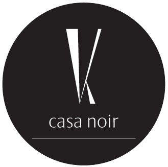
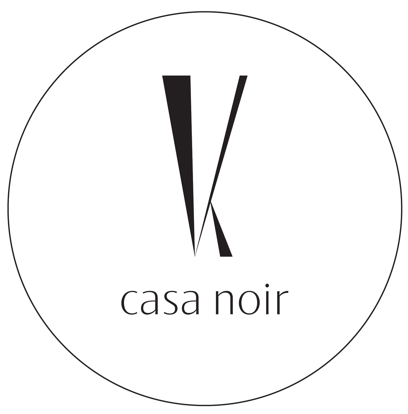
The VK Casa Noir logo uses minimalist geometric shapes to construct a stylized, modern VK monogram. Built from elongated triangular forms, the final mark delivers a distinctive and elegant visual presence.
The Inverted Triangle: Symbolizes creative analysis, depth, and the process of concept development. This shape highlights the strategic thinking that underpins professional brand design.
The Single Intersection: The lines converge precisely at a single point, representing the intersection of creativity and strategy - the exact place where the strongest design solutions are born.
Elongated Proportions: The vertical scaling adds a sense of sophistication, elegance, and exclusivity. These proportions are a deliberate nod to premium branding, communicating confidence, quality, and a high standard of design.
Business Card Design
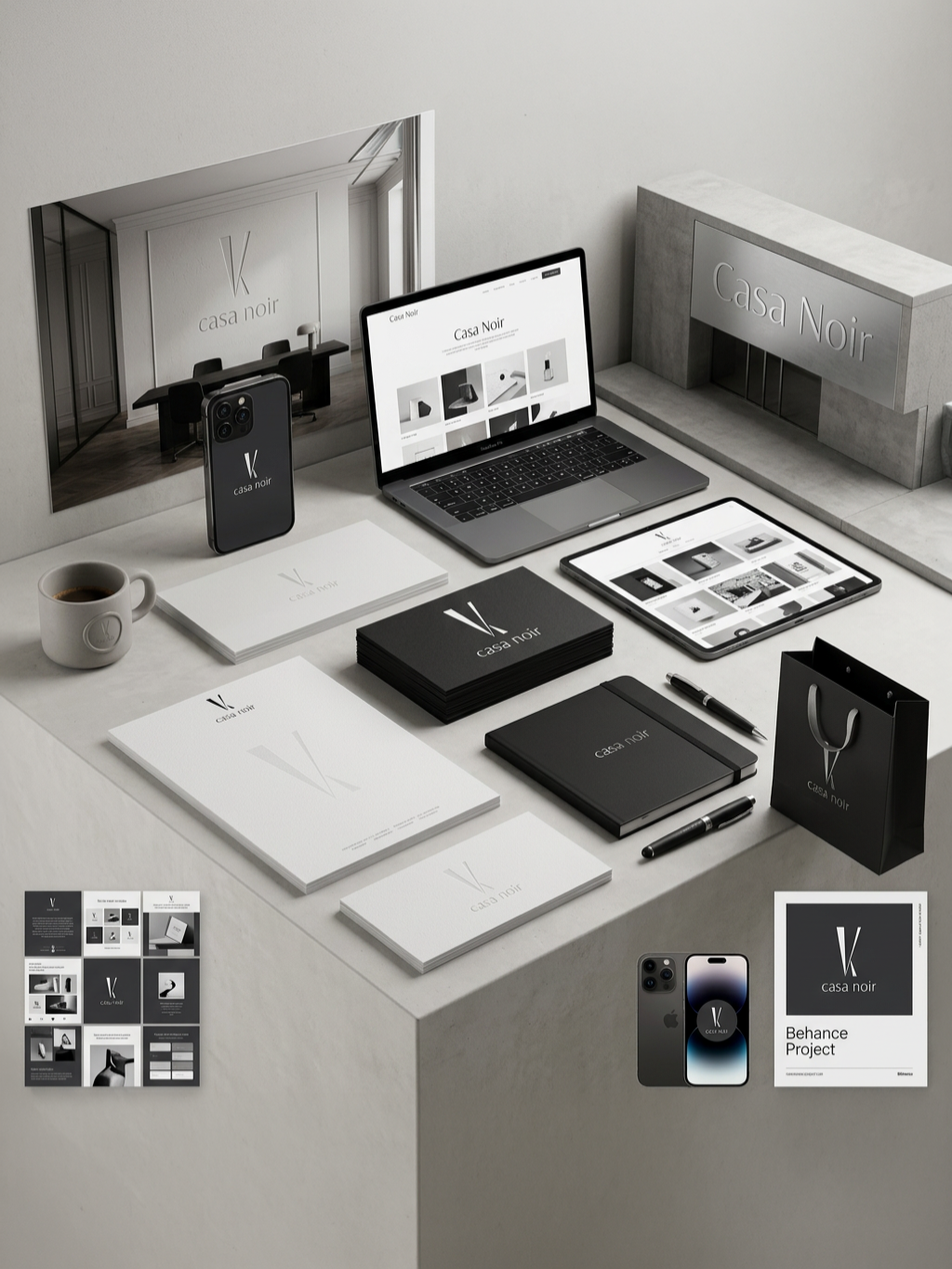
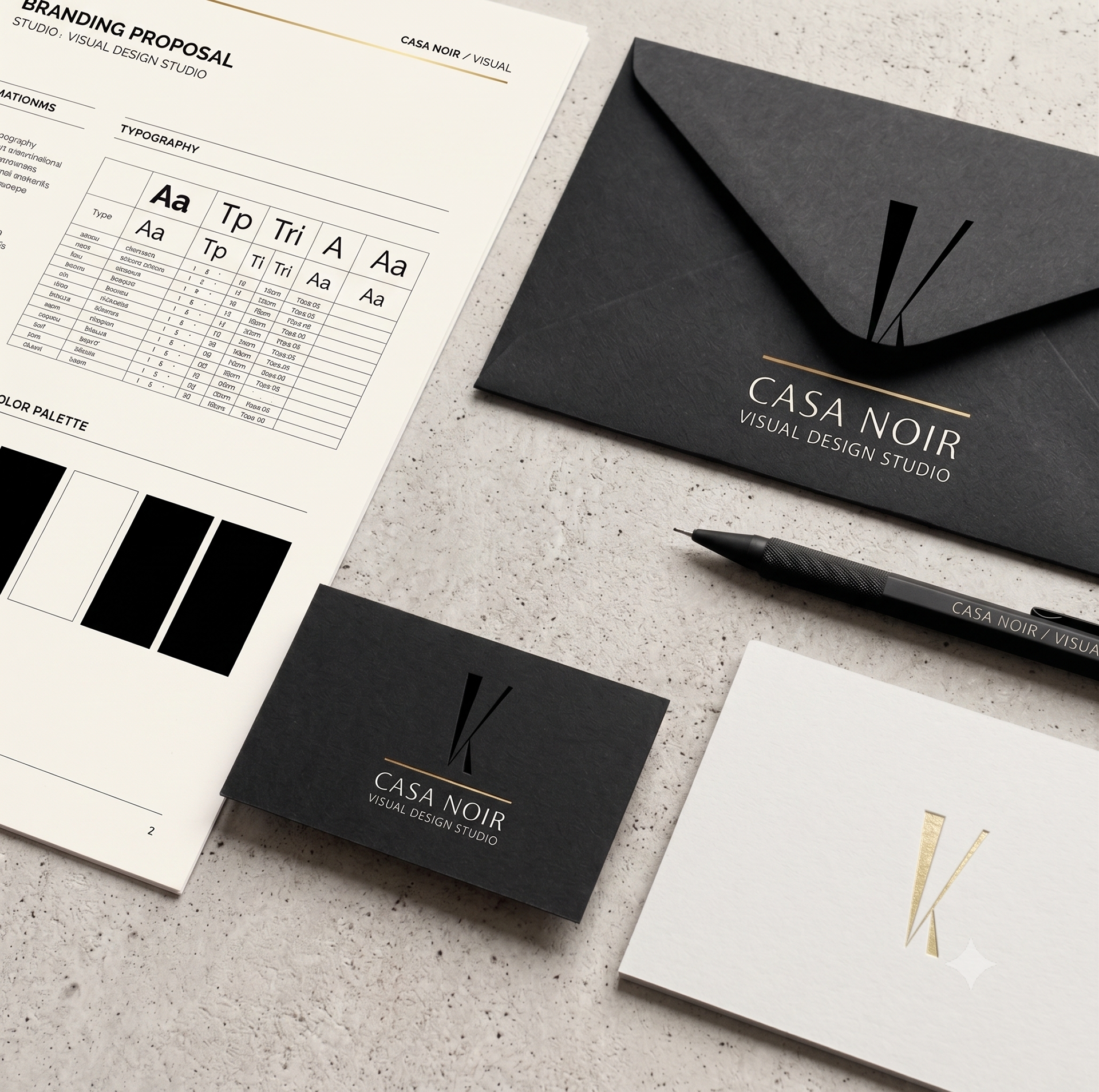
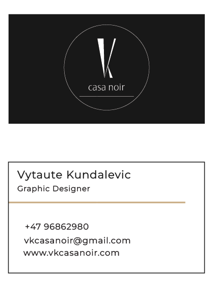
The VK Casa Noir business card is designed to reflect elegance, professionalism, and timeless sophistication. A minimalist layout, refined typography, and high-contrast color palette combine to create a tactile, premium impression that serves as a memorable first contact with the brand.
The Front (Clarity & Structure): Focuses entirely on clear communication, presenting contact details in a highly readable format. Generous white space reinforces a modern, open aesthetic, while a subtle gold accent line adds visual balance and a touch of understated luxury.
The Back (Impact & Identity): Gives the stylized logo center stage. A rich, dark background creates a stark contrast against the white mark, emphasizing exclusivity, confidence, and strong brand recall.
Design Objectives & Key Elements
Core Objectives:
- Establish a premium, memorable first impression.
- Maintain a clean, timeless, and uncluttered visual style.
- Ensure effortless readability and clear communication.
- Strengthen brand recognition through strict identity consistency.
Key Elements:
- Palette: Black (authority & sophistication), White (clarity & balance), and Gold (subtle luxury & quality).
- Typography: Minimalist and highly refined for a contemporary feel.
- Composition: High contrast and purposeful layout that balances beauty with function.
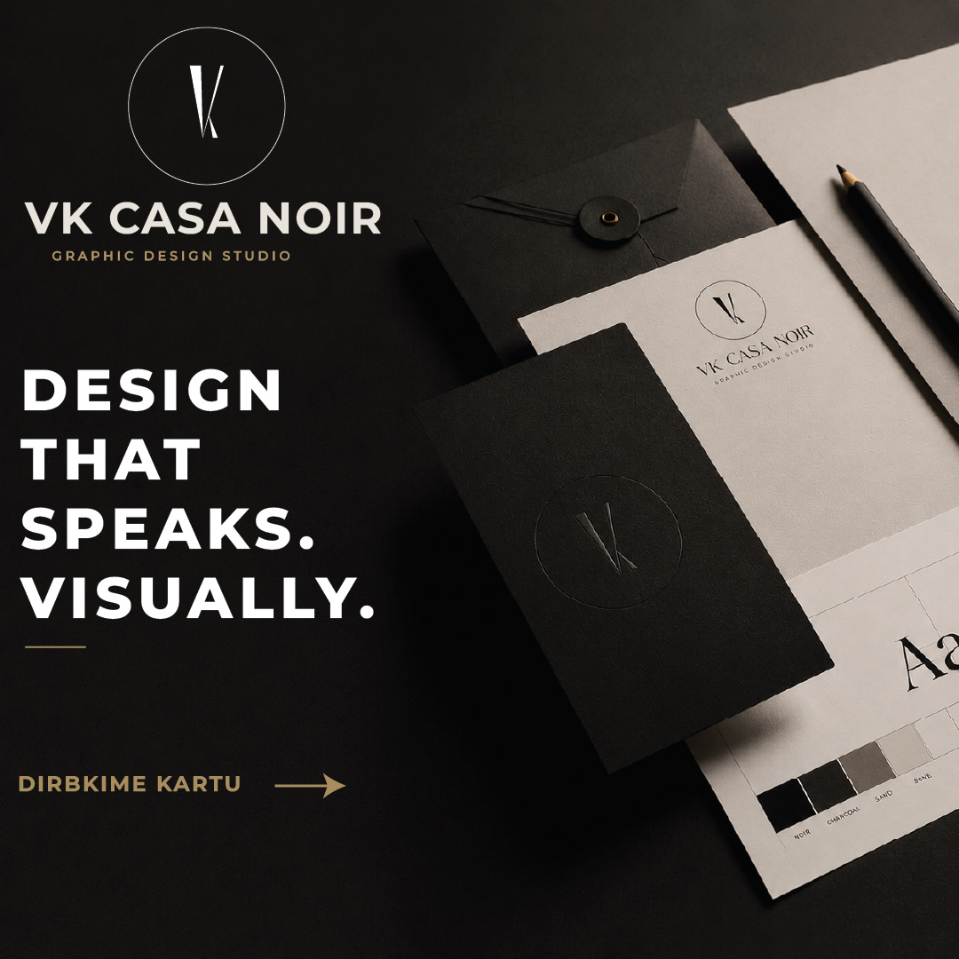
VK CASA NOIR - Social Media Campaign
A promotional social media feature designed to showcase the visual identity and creative direction of VK Casa Noir. The concept pairs elegant typography with a premium, black-and-gold aesthetic to communicate strategic design thinking, creativity, and absolute professionalism.
The layout highlights the studio’s core services - including branding, print, digital design, and visual identity development - while maintaining a sophisticated, timeless look that remains perfectly consistent with the brand.
AI Visualizations
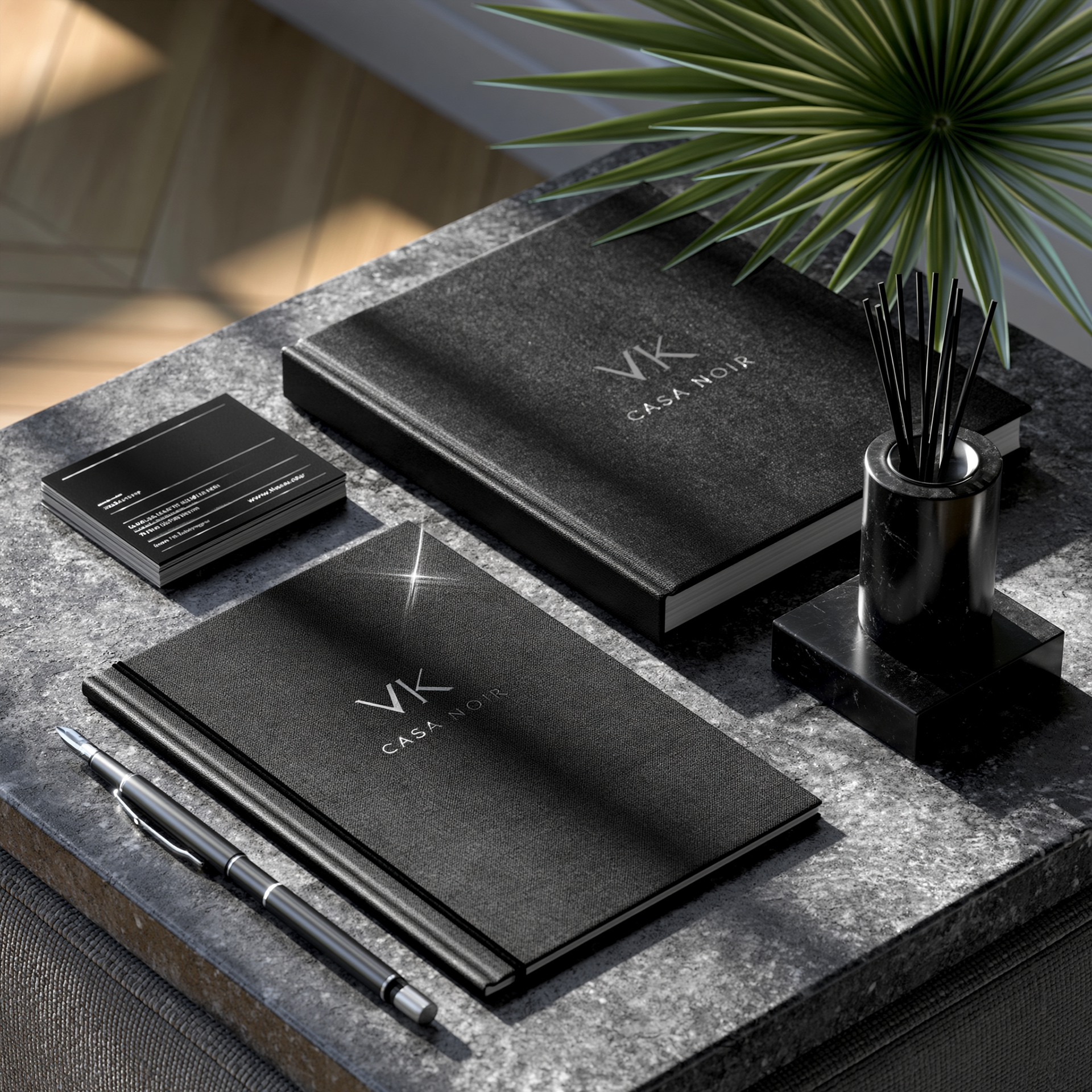
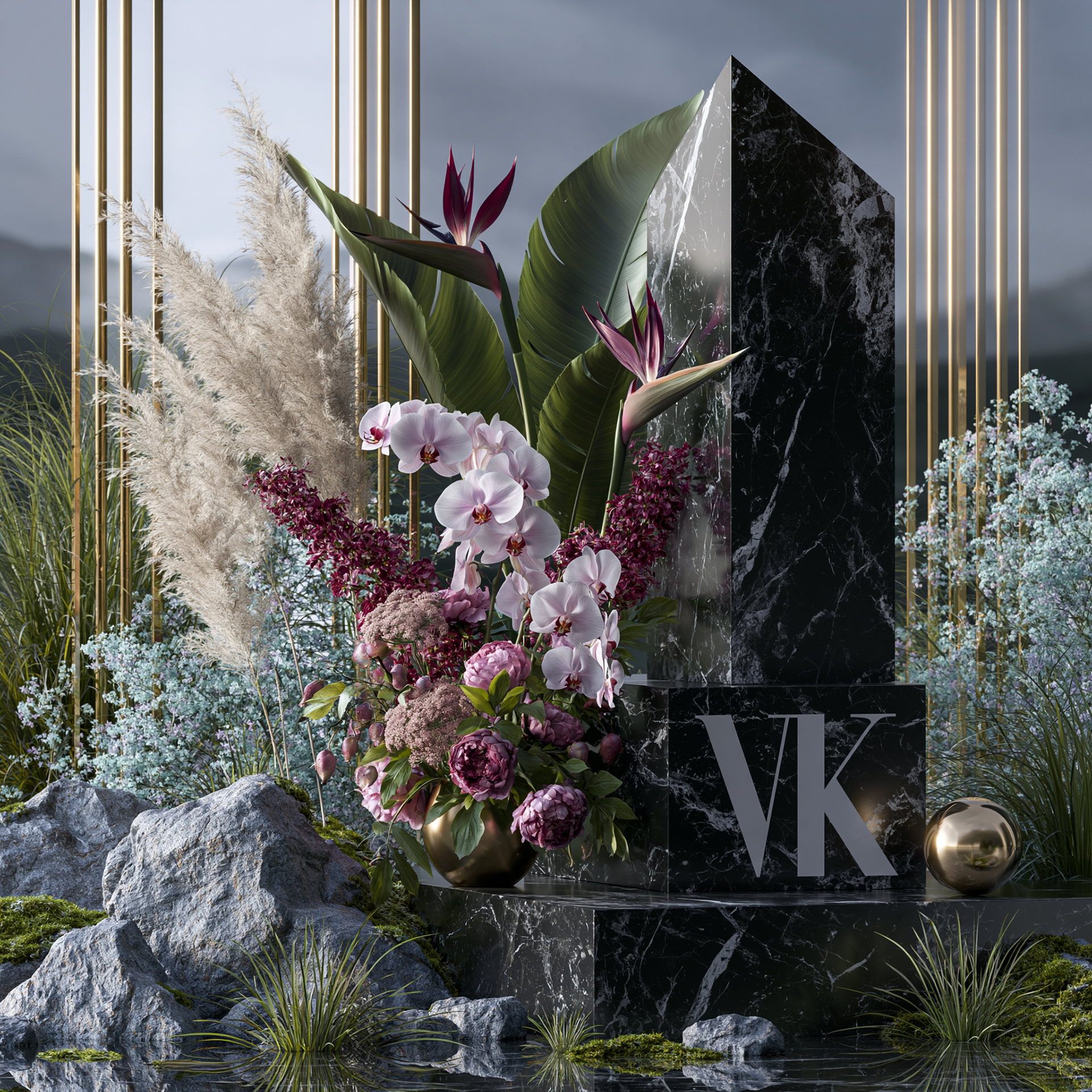
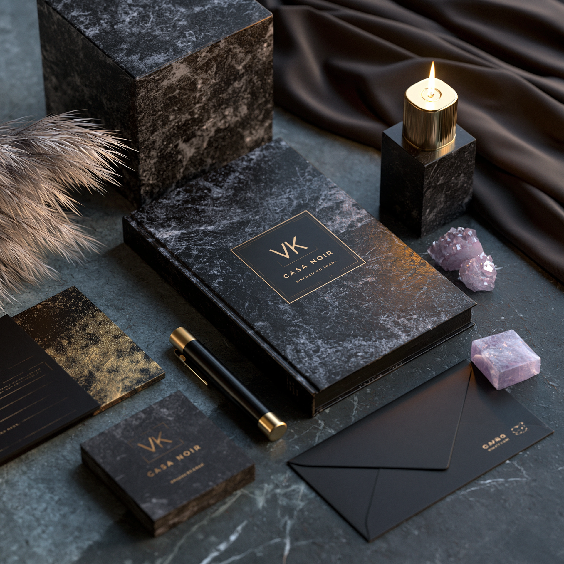
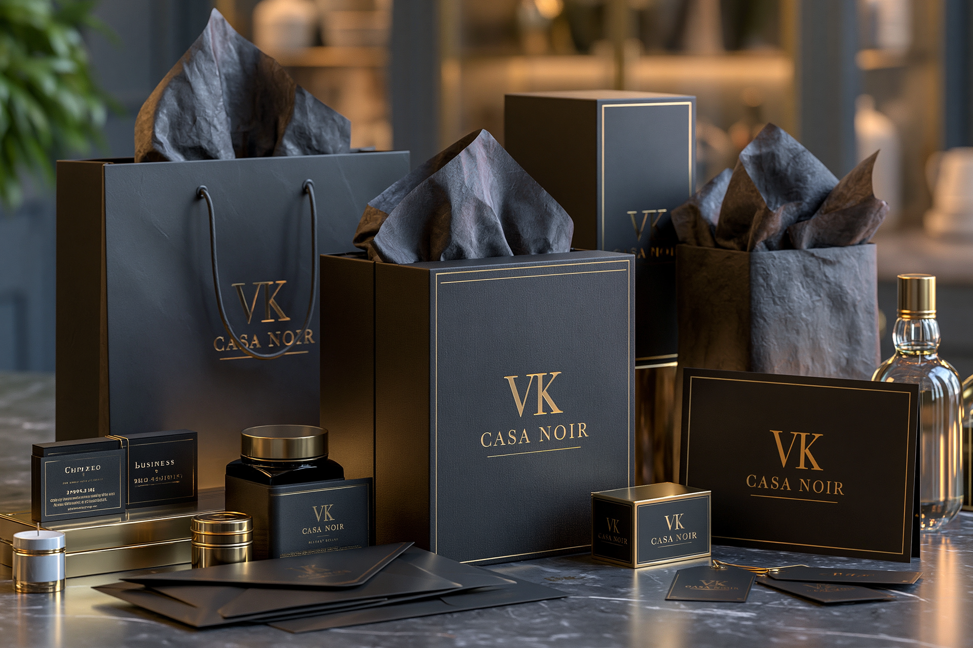
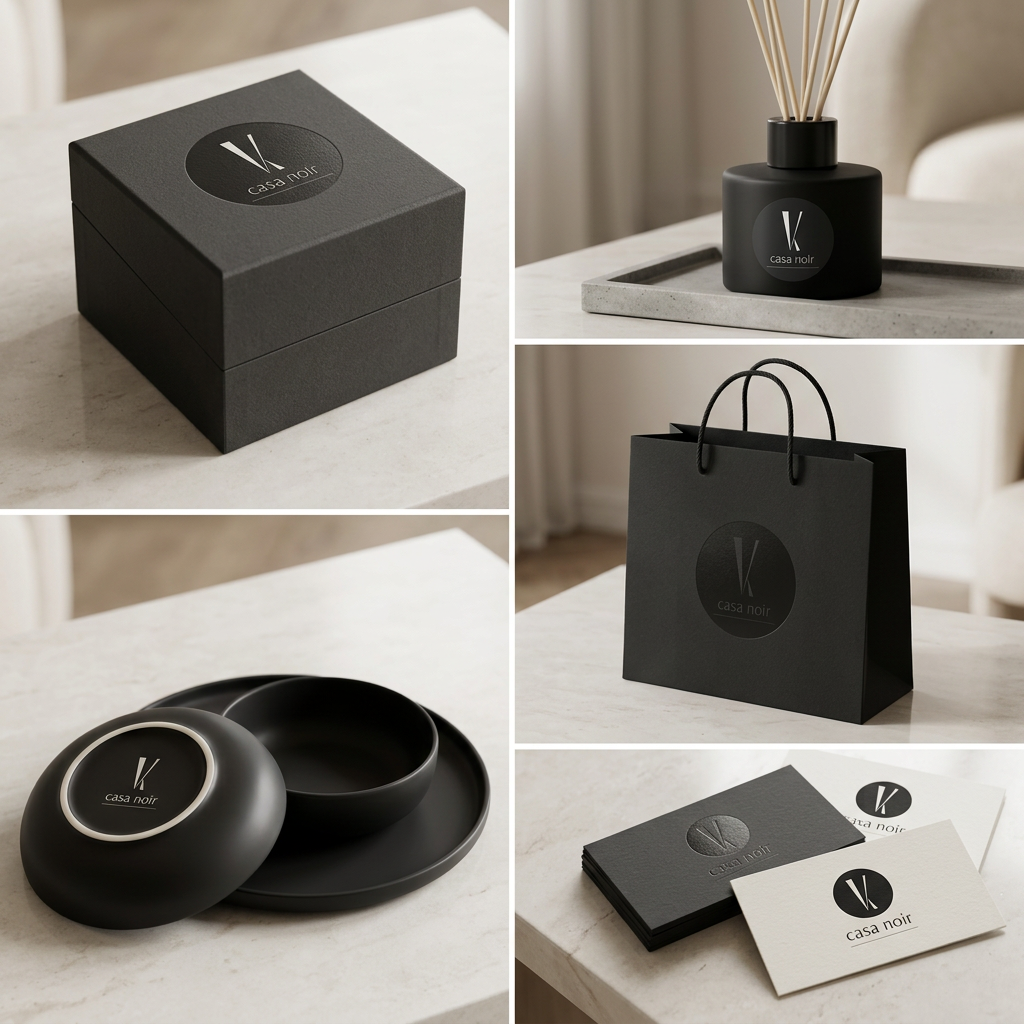
Several visualizations within this project were developed using Midjourney. These AI-generated images were used to capture the aesthetic direction, mood, and visual character of the VK Casa Noir brand, showcasing the identity in realistic and inspirational settings.
Each image was carefully curated to complement the presentation and reflect the studio’s core values: elegance, professionalism, and subtle luxury. By using AI as a creative support tool, the project achieves a deeper level of visual communication and a more immersive brand presentation.