Håndtverksenter MK Logo Concept
Håndverksenter MK is a Norwegian construction and renovation firm. Its visual identity was strategically developed to bridge the gap between rigorous, professional craftsmanship and a high-end luxury aesthetic. Moving away from traditional construction branding, the custom logo was designed to signal exclusivity, positioning the company as a top-tier service provider that delivers an elevated standard of quality.
Logo Concept
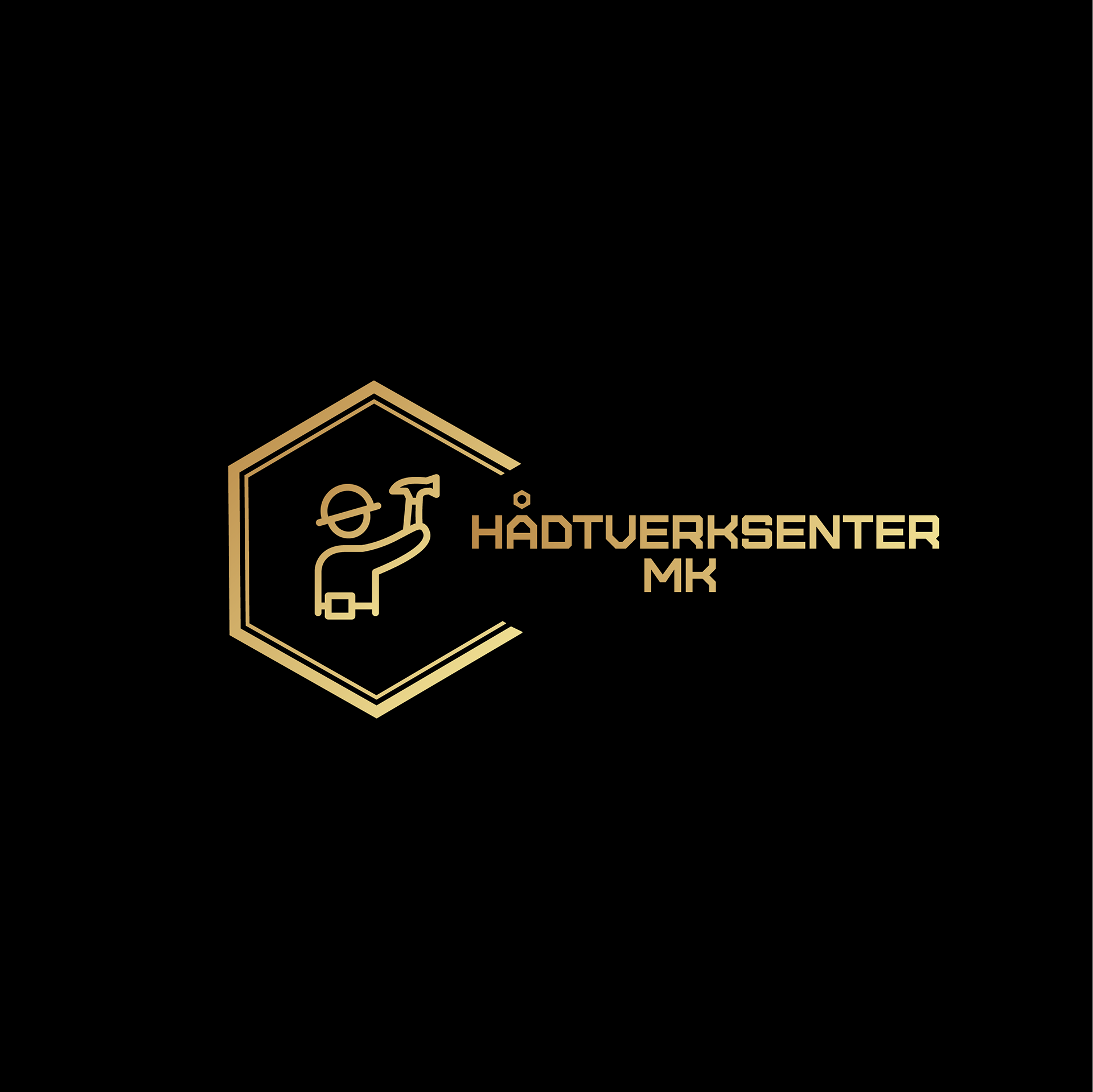
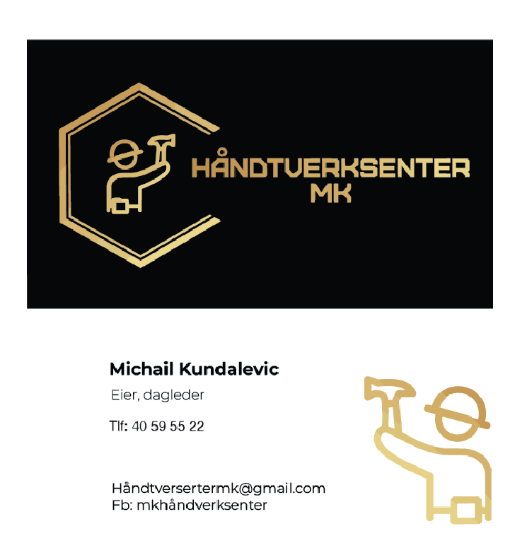
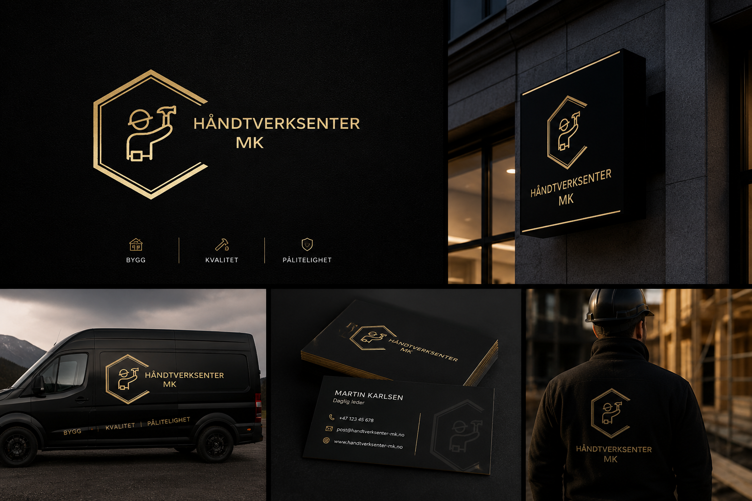
The Håndverksenter MK logo centers around a geometric hexagon, chosen for its architectural associations with structural reliability, strength, and balance. These qualities mirror the company's commitment to safety, precision, and high-caliber execution. Embedded within the geometric form are subtle, industry-specific cues that denote hands-on expertise and professional craftsmanship. The resulting mark reinforces the company’s core competencies in high-end construction, renovation, and finishing.
Color Strategy
The Black Base: Conveys a foundation of professionalism, prestige, and absolute trust.
The Gold Accents: Elevate the brand with a sense of luxury, exclusivity, and sophisticated craftsmanship.
Brand Colors
Gold | #A88D5D
Represents excellence, premium service, trust, and attention to detail.
Black | #000000
Represents professionalism, elegance, sophistication, and reliability. Roach to business.
The Symbolism of Gold:
Excellence: Superior workmanship and a "gold standard" of service.
Authority: Professional expertise and technical mastery.
Precision: A sharp focus on fine details and finishing.
Longevity: Creation of enduring, long-term value for clients.
How the Logo Reflects the Company’s Services
Architectural Precision:
The geometric structure serves as a visual testament to precision, stability, and structural reliability.
Industry Expertise:
Integrated tool iconography provides an immediate, explicit connection to the company’s core construction and renovation capabilities.
Modern Professionalism:
A minimalist design philosophy discards clutter to communicate forward-thinking professionalism and a contemporary business mindset.
Premium Positioning:
The deliberate black-and-gold color palette elevates the brand, firmly positioning the company within the luxury service sector.
Operational Excellence:
The clean, balanced composition mirrors an organized workflow and an uncompromising commitment to quality in every project.
Final Outcome
The resulting identity successfully synthesizes Håndverksenter MK’s technical capability with an uncompromising commitment to premium execution.
By pairing a modern aesthetic with luxury design cues, the brand effectively differentiates itself within a competitive Norwegian market.
This strategic positioning not only fosters immediate client trust but also establishes a commanding, highly recognizable market presence that reflects a higher standard of service.
Business Card Design
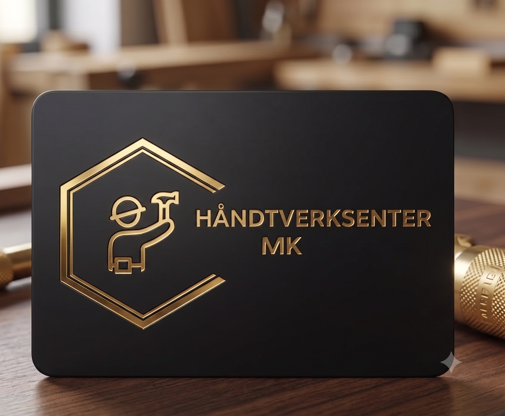
The Håndverksenter MK business card is designed to look professional, clean, and premium. The black and gold colors give it a sophisticated feel, while the minimalist layout keeps the information clear and easy to read.
Front: Showcases the logo to make a strong first impression.
Back: Displays contact details in a neat, organized layout, featuring the brand icon to help clients remember the name.
Overall, the card reflects the company's high-quality craftsmanship and organized way of working.
AI-Generated Brand Visuals
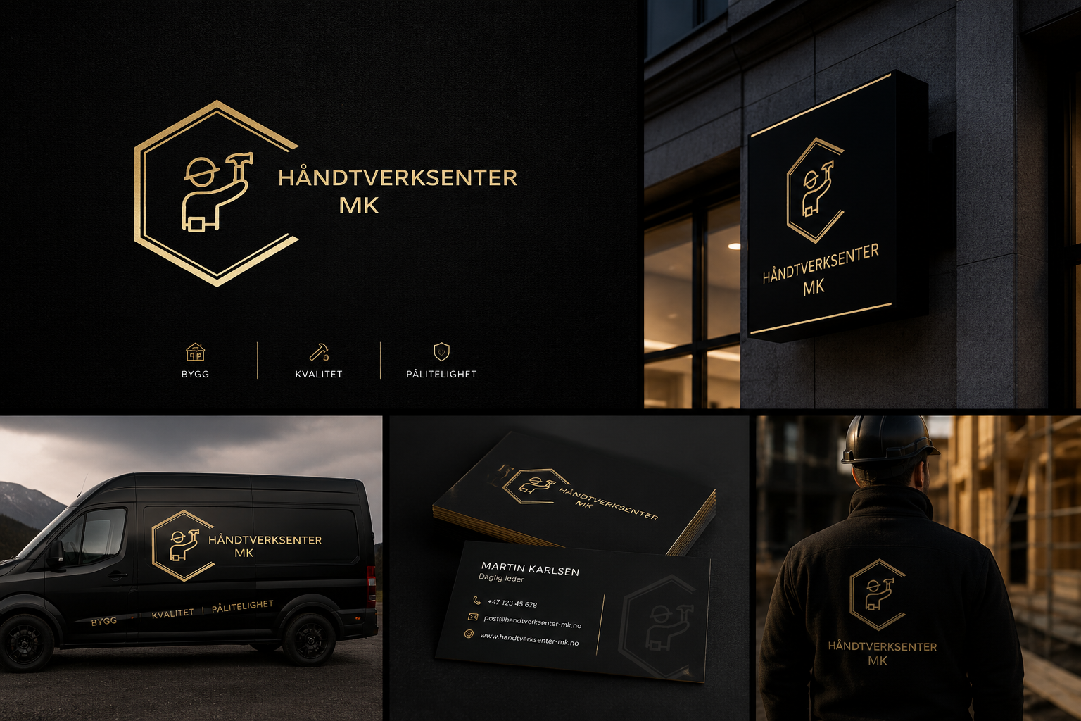
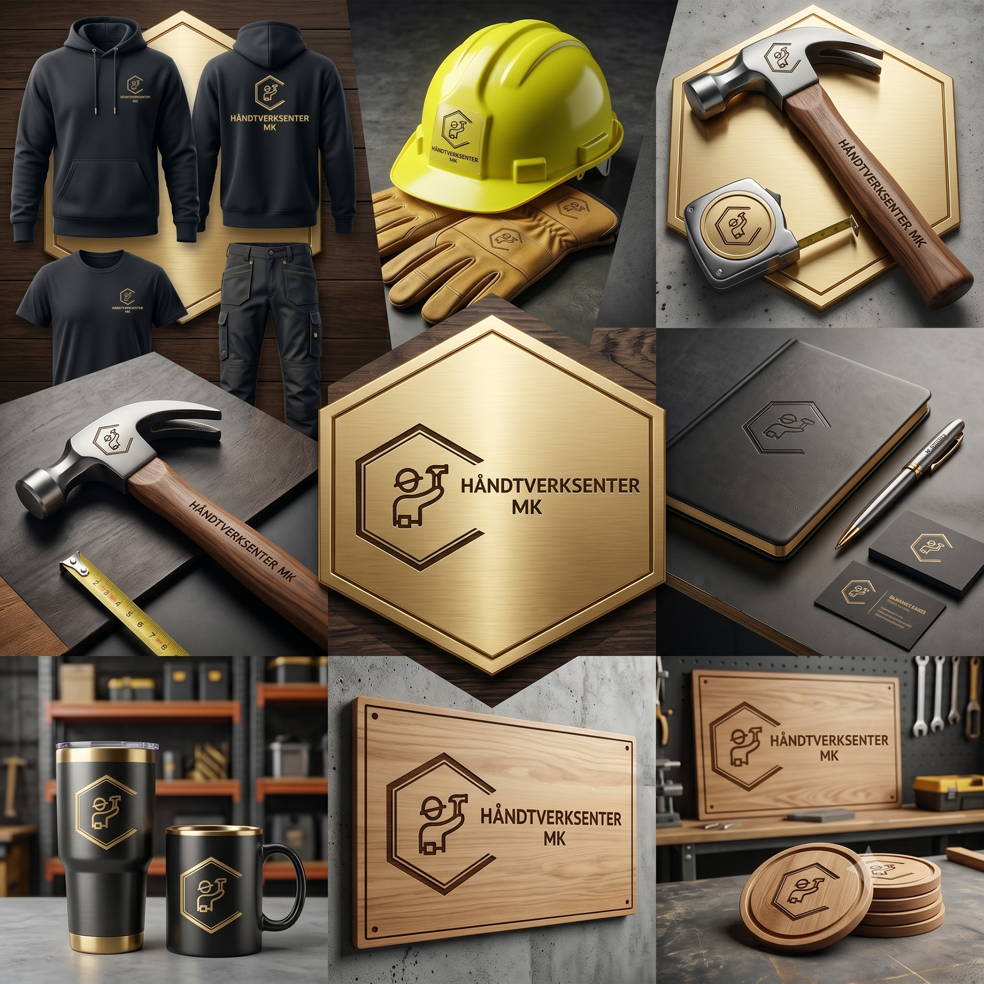
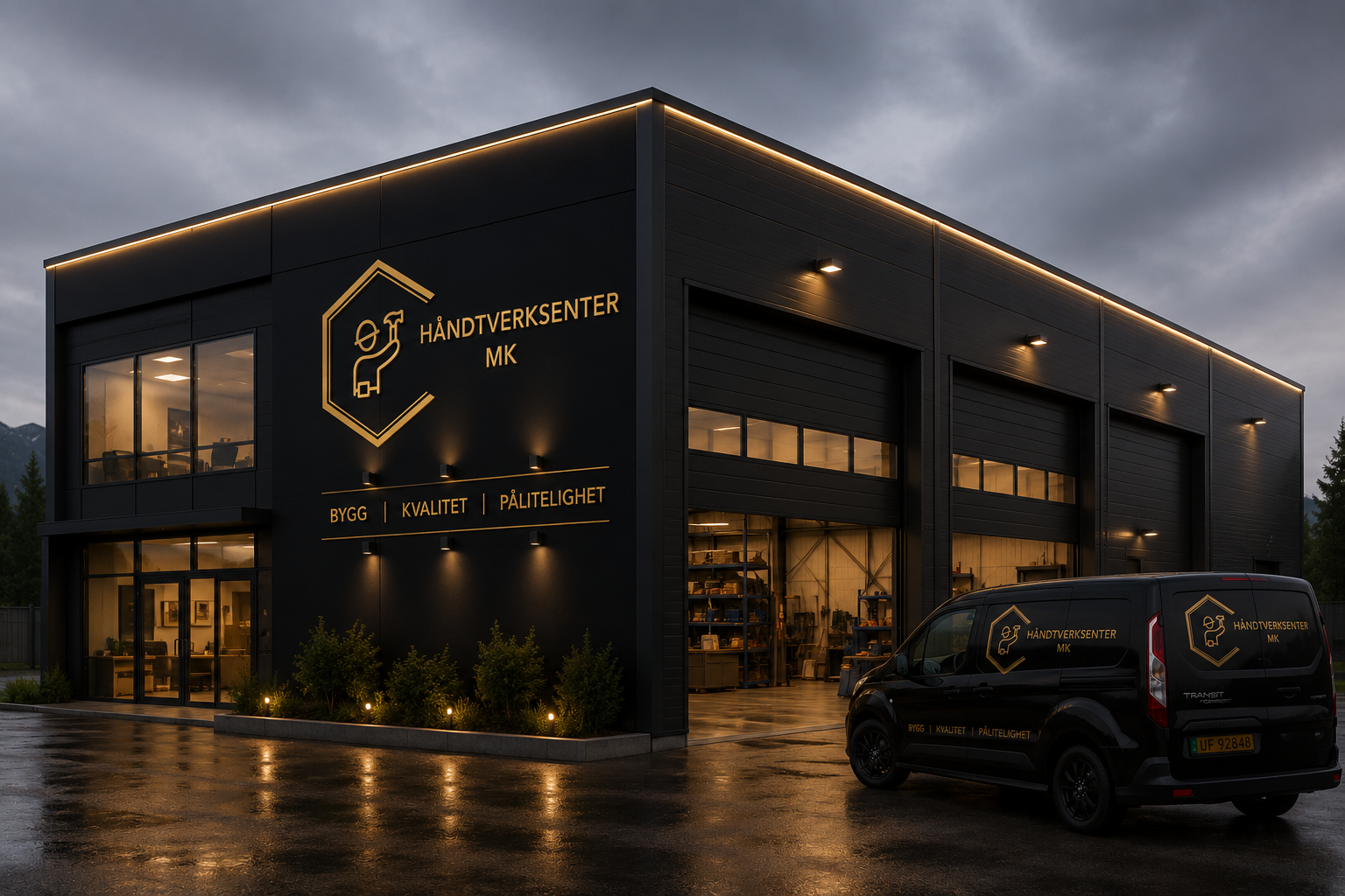
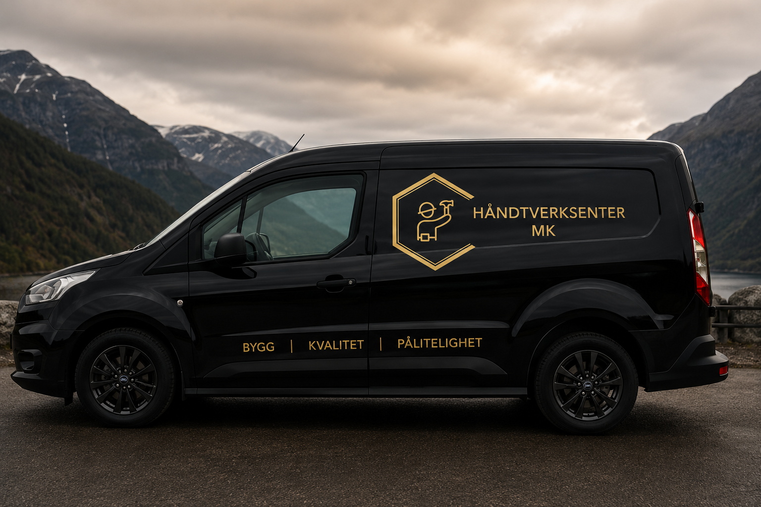
At the client’s request, we also used AI to create a series of custom brand visuals. These mockups show how the Håndverksenter MK identity looks in real-world settings, such as company vehicles, workshops, signage, and workwear.
These realistic images helped the client see the brand's full potential and ensured the design worked well across different materials. Combining the logo with these high-quality visuals gave a much clearer picture of the company’s professional, premium image.
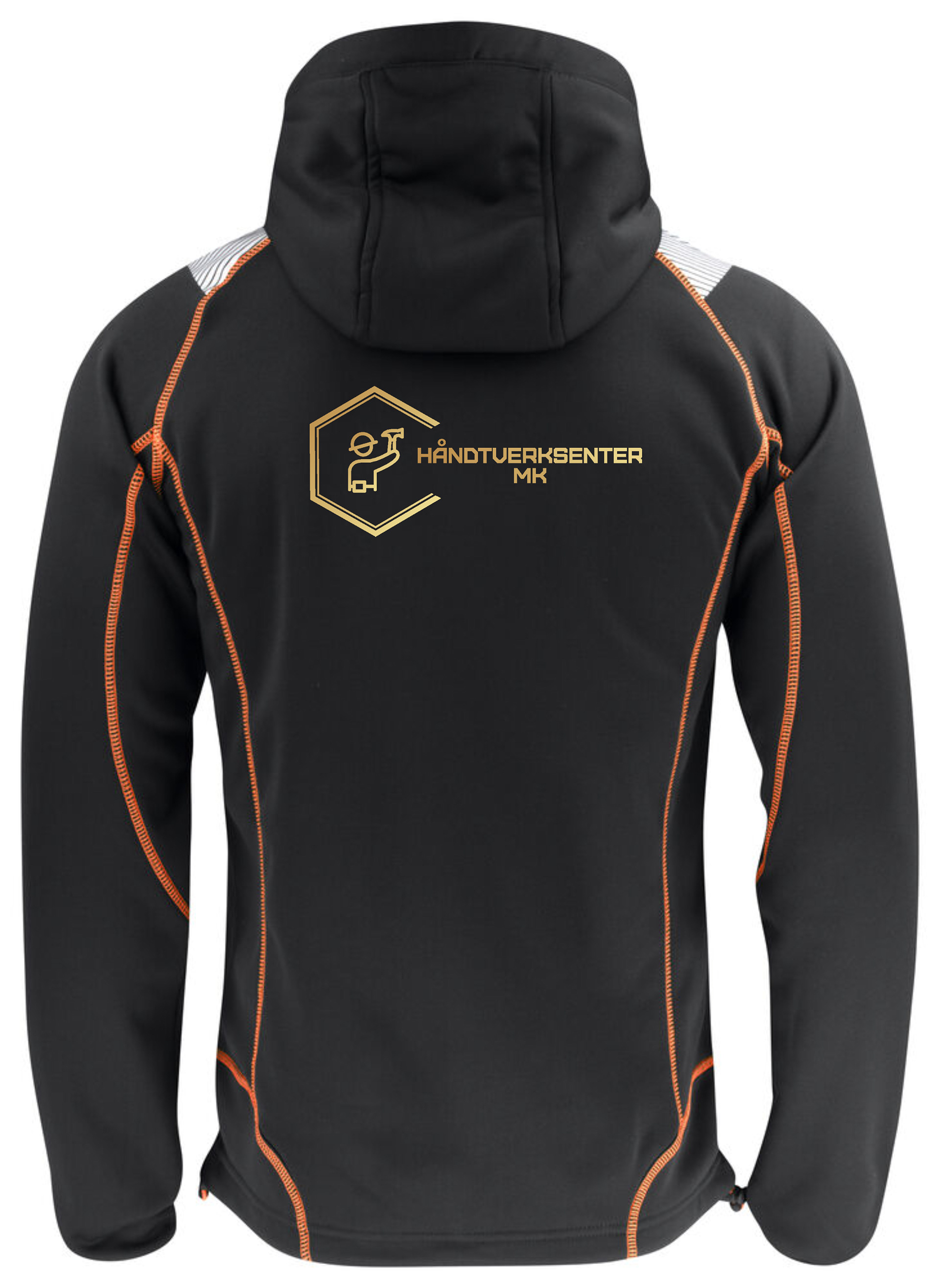
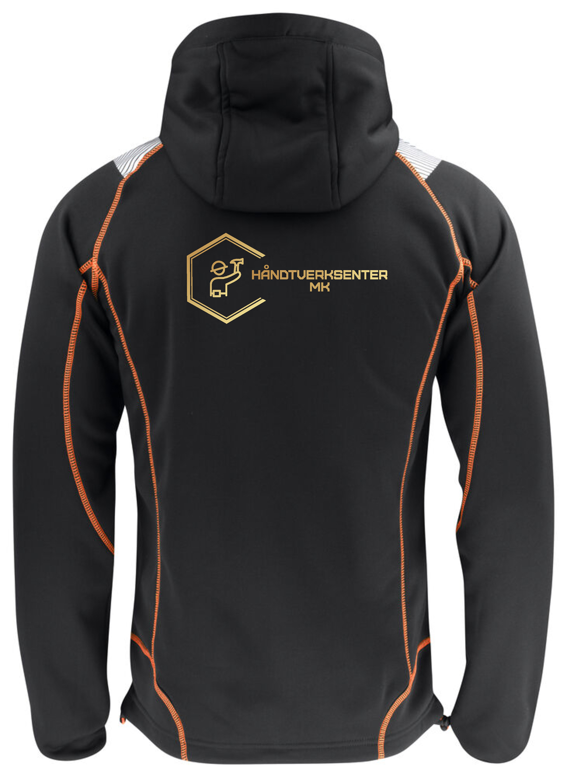
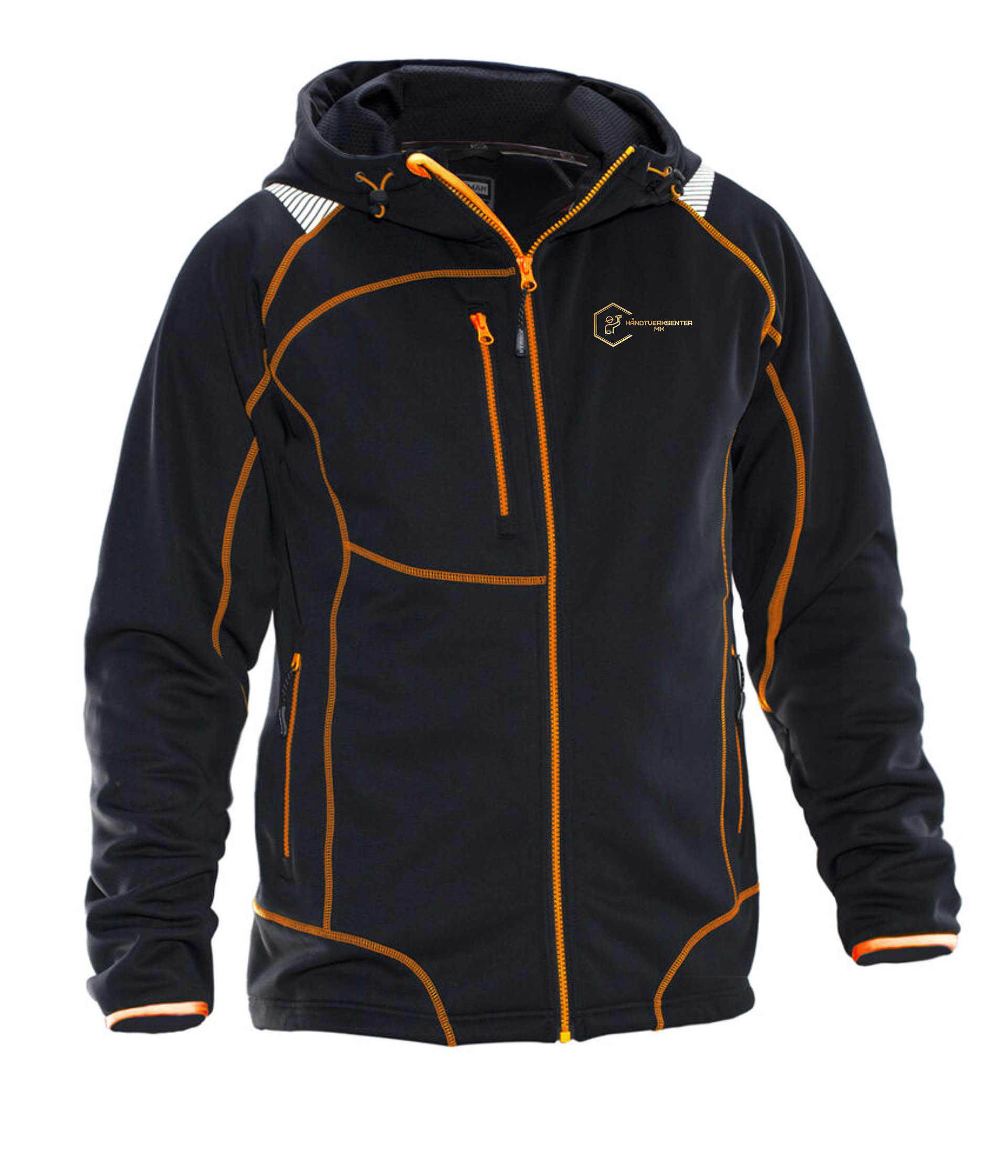
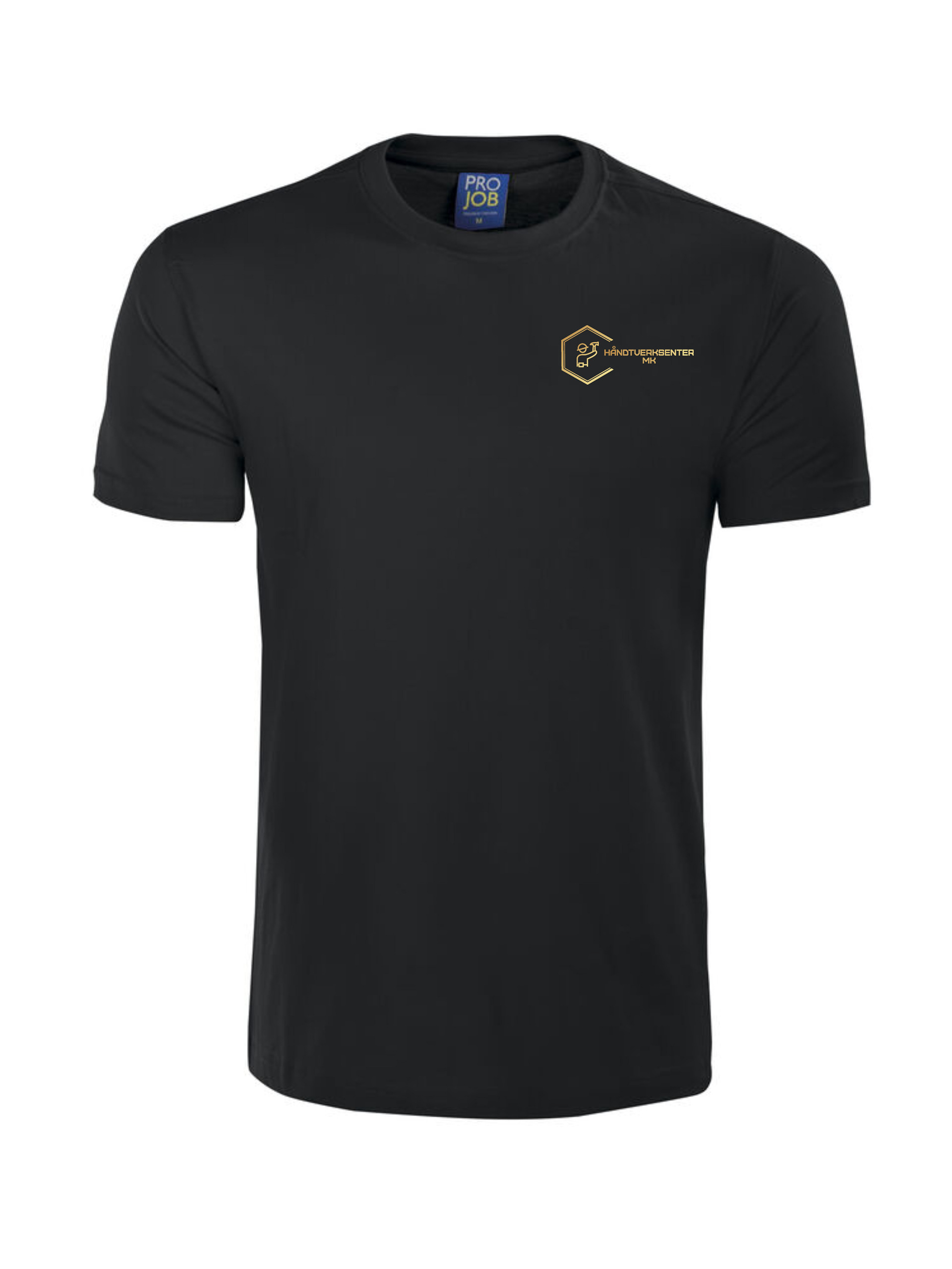
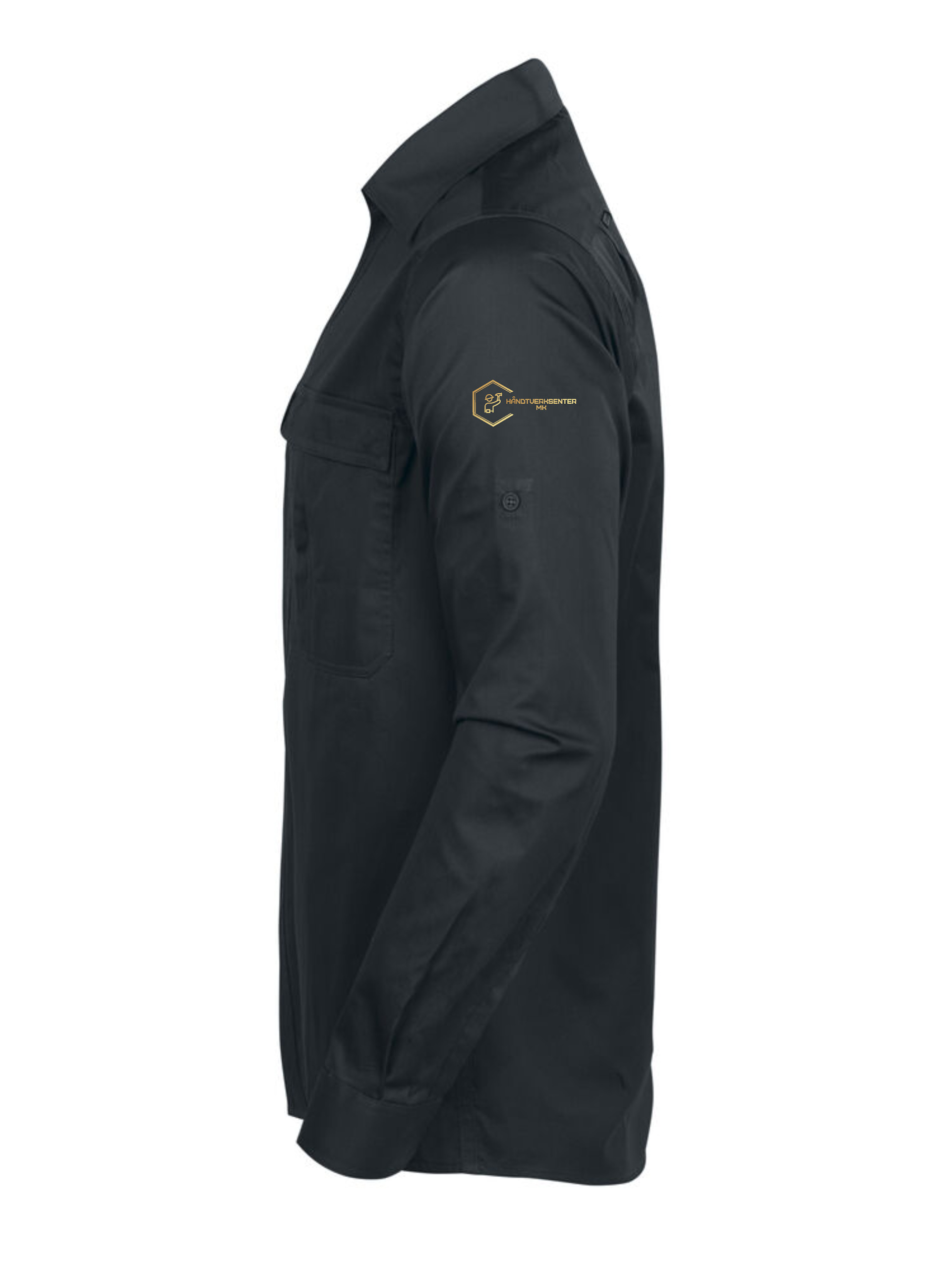
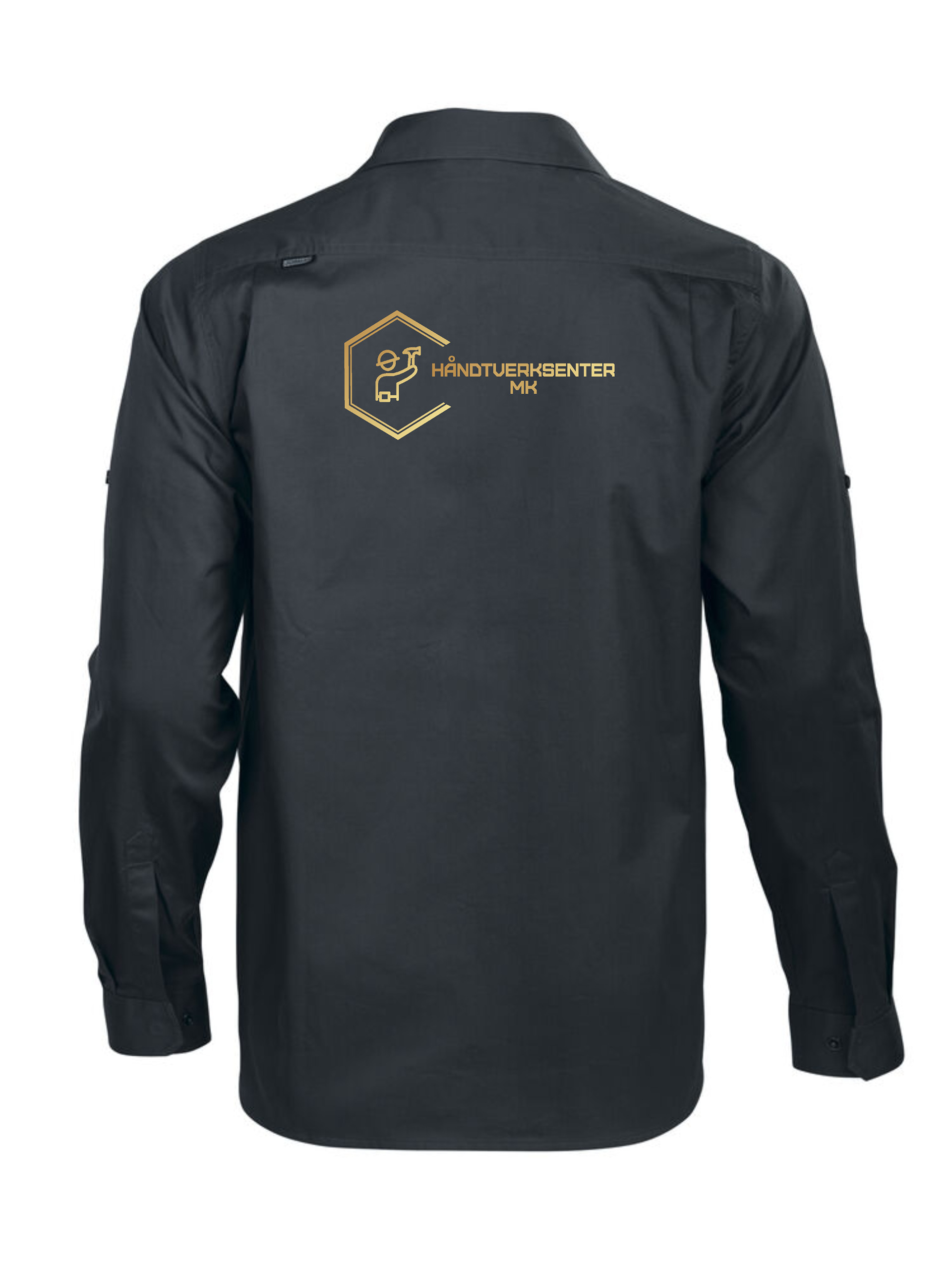
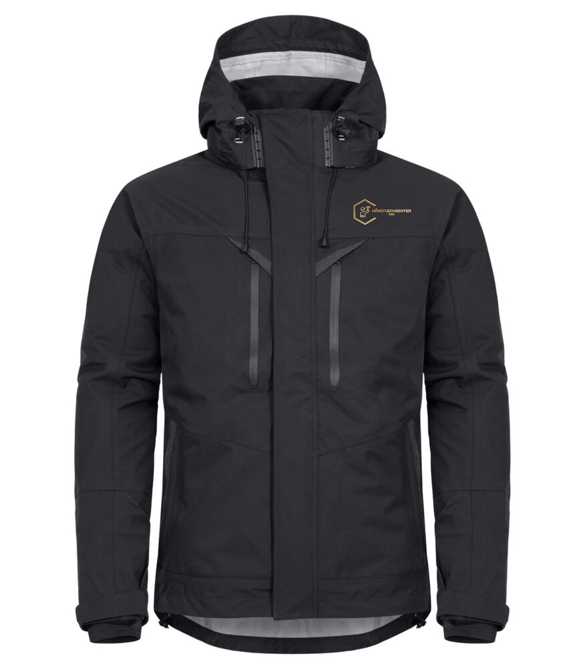
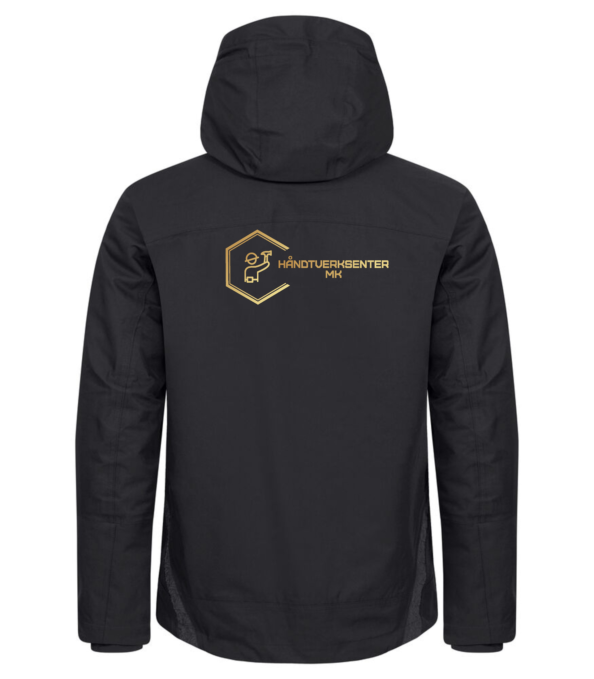
Workwear Design
To keep the company image consistent, we designed custom workwear that extends the brand identity to the job site. The clothing features the logo and the black-and-gold palette in a clean, minimalist style. This ensures team members look professional during client interactions while turning their work apparel into a tool for building brand recognition and trust.